Excel Dashboard Template Example Files
This page is set to be converted into Chinese shortly.
The dashboard section of thesmallman has lots of Excel dashboard templates for you to download and use with your own data. The goal of the site is to create a visual hub for Excel dashboard design with a range of different dashboards, from financial to organisational and in one case sporting. The first part of the article deals with the theory of Excel dashboard design with some pictorial examples of dashboards I have created for CPA Australia. Next there are links to pages on the site with a range of Excel dashboard templates.
The following brief article describes some of the rules behind creating informative and visually effective Excel dashboards. The art of creating stylish Excel dashboards is not an easy one to master. I will admit I have made my share of mistakes in Excel dashboard creation but I hope I am learning and improving the quality of information and appearance at the same time. There are a great many Excel dashboard examples on this site and it has taken a considerable amount of time to compile them so you should not have to. I hope you find the Excel dashboard example you are looking for.
The following outlines some key Excel dashboard design rules. Simple use of colours, clean design which is easily read. There are some key things to consider when creating an Excel dashboard. Excel dashboards should ideally be;
- Understandable and easily read. There should be no confusion over what each of the metrics mean.
- Interactive so can be changed to reflect different areas of an organisation.
- Able to display the key measures of the time. Work out what is important and use those key items in the dashboard.
- Liberal with white space. 'White Space' is the areas you are not using and they are just as important visually as the areas you are using on a Dashboard.
- Clearly labelled, each of the Charts and Tables on the dashboard need to display a clear message.
Excel dashboards are a very valuable corporate tool when created with forethought. An organisation can see all of the key information in one place and see how it is tracking against the key criteria. The following are some examples of Excel dashboards which I have put together. The information in these Excel dashboards is not real, it is for demonstration purposes only. After going through the exercise of creating all of these Excel dashboards I can say one thing with complete certainty, making Excel dashboards is a lot of work but very worthwhile when you see the final working result.
One of the issues with developing the following Excel dashboards is obtaining the data. I would scratch my head as I started creating the raw data from scratch early on. Later I got a bit smarter and found that wiki and some government websites had ready made tables which were Excel compatible. I then just needed to sketch out a final output dashboard and work backwards to make the data fit that vision. Many of the techniques spoken about in the site which I have incorporated on TheSmallman.com are built into these Excel dashboards. On the whole these Excel Dashboards do not need VBA at all. There are a couple of exceptions when you get down to the Heat Map section but mostly native Excel run these dashboards.
The following are the site's current Excel dashboards. I will be creating more and more Excel dashboards and these dashboards will be free to download. Click on the link or picture to visit the specific Excel dashboard page. An Excel file is on every page with a brief description of the Dashboard.
Excel Dashboard Templates
The next section contains a selection of the Excel dashboards on this site. All have an associated Excel dashboard template which is fully functional and has a complete data set inside it. The dashboards are all a little different, some spin on combo boxes, option buttons, slicers and there is a few that changed based on the mouse rolling over a cell or two. Enjoy.
Corporate Dashboard Report
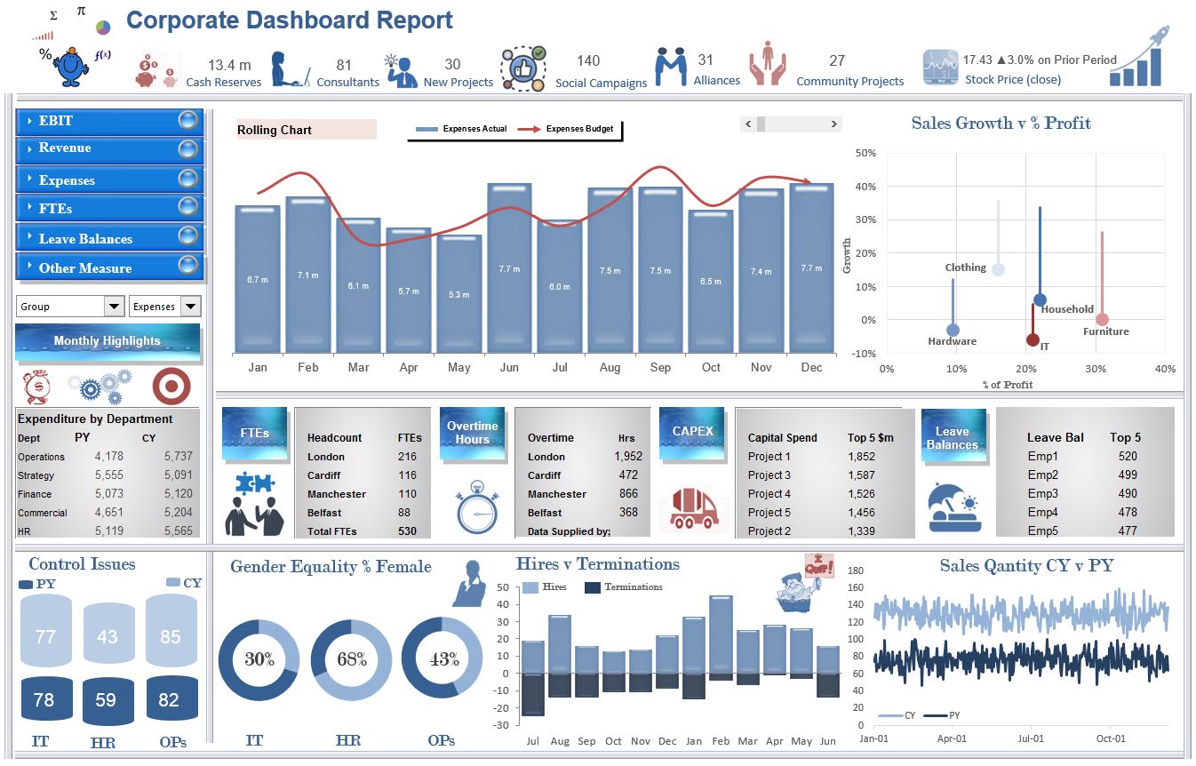
The EBIT Excel Dashboard report is an update of another of the original dashboards on the site. I have used some relevant infographic elements to spice the dashboard up a bit. It is functional and tells the Excel story of a company based in the update of two combo boxes. Splits the dashboard by reporting metric and group. The following is a link to the dashboard template.
Department Dashboard in Excel
Operational Dashboard Report
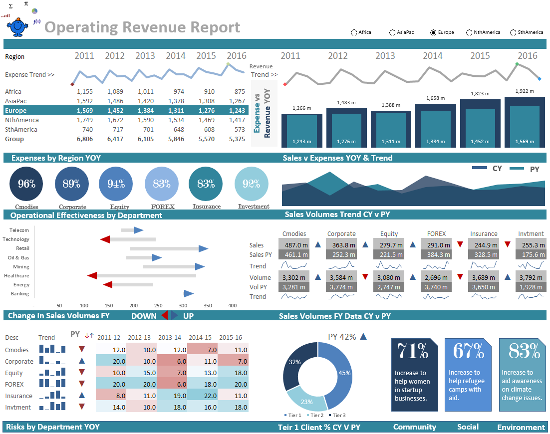
The above Excel Dashboard shows a range of metrics on a single page from an operations perspective. The underlying business is primarily banking however, the underlying data set can be adapted to fit a range of businesses. This dashboard did not take entirely long to produce relative to the other ones - perhaps I am learning... The following is a link to the dashboard template.
Corporate Summary Excel Dashboard
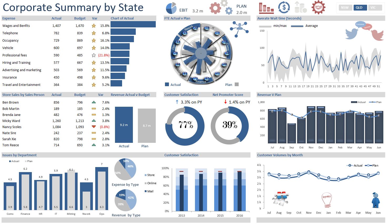
The above Excel Dashboard displays a range of organisational metrics from revenue, expenses, FTE, Issues all against a "well thought out plan". The underlying dataset is split over several sheets and the report updates via a slicer at the top of the Dashboard which allows it to spin by State. It is highly interactive and very user friendly - enjoy. This link takes you to the dashboard template.
Consulting Excel Dashboard
Traffic Light Excel Dashboard
Key Measures Excel Report
Excel Revenue, Expense and Staffing KPI Report
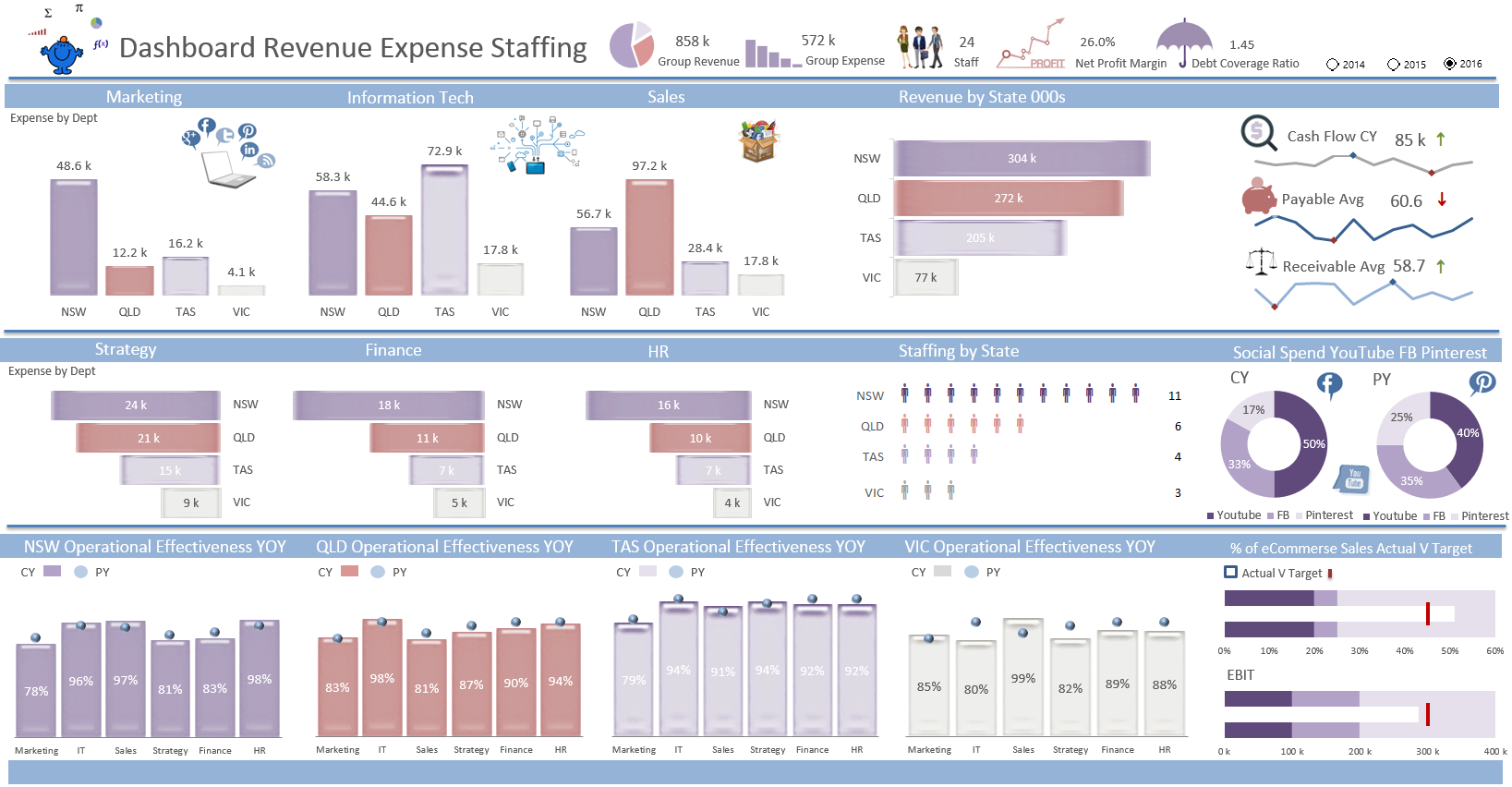
This KPI Report is an update to one of the original dashboards on the site. I have reworked the dashboard and added additional features to fit inside a single page. The toggle at the top right of the report allows the user to spin the information by year which will change all of the data within the display. It is a functional report which displays a lot of information about various groups within an organisation in a small amount of space. The following is a link to the Excel dashboard template.
Human Resources Dashboard
The Human Resources - HR Dashboard is a mixture of employee related information, from salary, hires, employee satisfaction, age demographics and much more. All split by department and sub department. It makes a very nice template for a human resources department to track a range of key performance metrics. To get to the dashoard template either click the picture above or the link below.
Traffic Light Dashboard
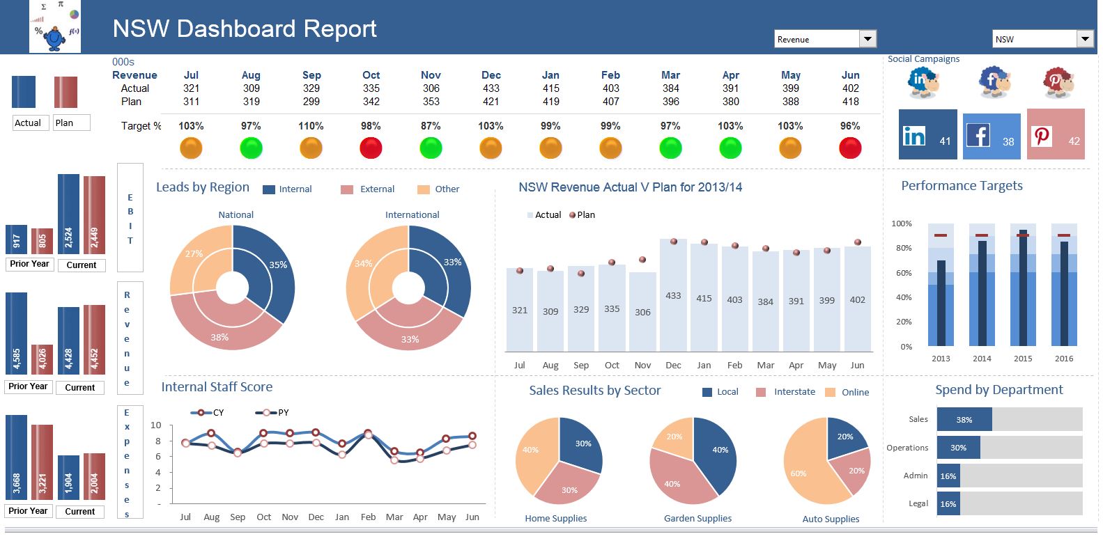
This Excel dashboard uses example data to display actual V plan data and shows EBIT, revenue and expenses graphically at the side. There is a traffic light effect to indicate progress against plan for each of the areas of the organisation and a combo box to choose which area's financials you want to see. It was the very first Excel Dashboard I incorporated into thesmallman.com, so it gets centre.
Sales Excel Dashboard
The Sales Excel dashboard highlights the month in focus with a light blue bar depending on the month shown in the drop down. You can see from the chart that September is in focus so the bar shifts to light blue in September and all of the other Charts change to reflect that month. The dashboard also has a traffic light setup.
Turnover Excel Dashboard
The Turnover Excel dashboard features price and turnover by region. The dashboard uses an Excel slicer on the main page to isolate coutries in the chart.
Key Measures Excel Dashboard
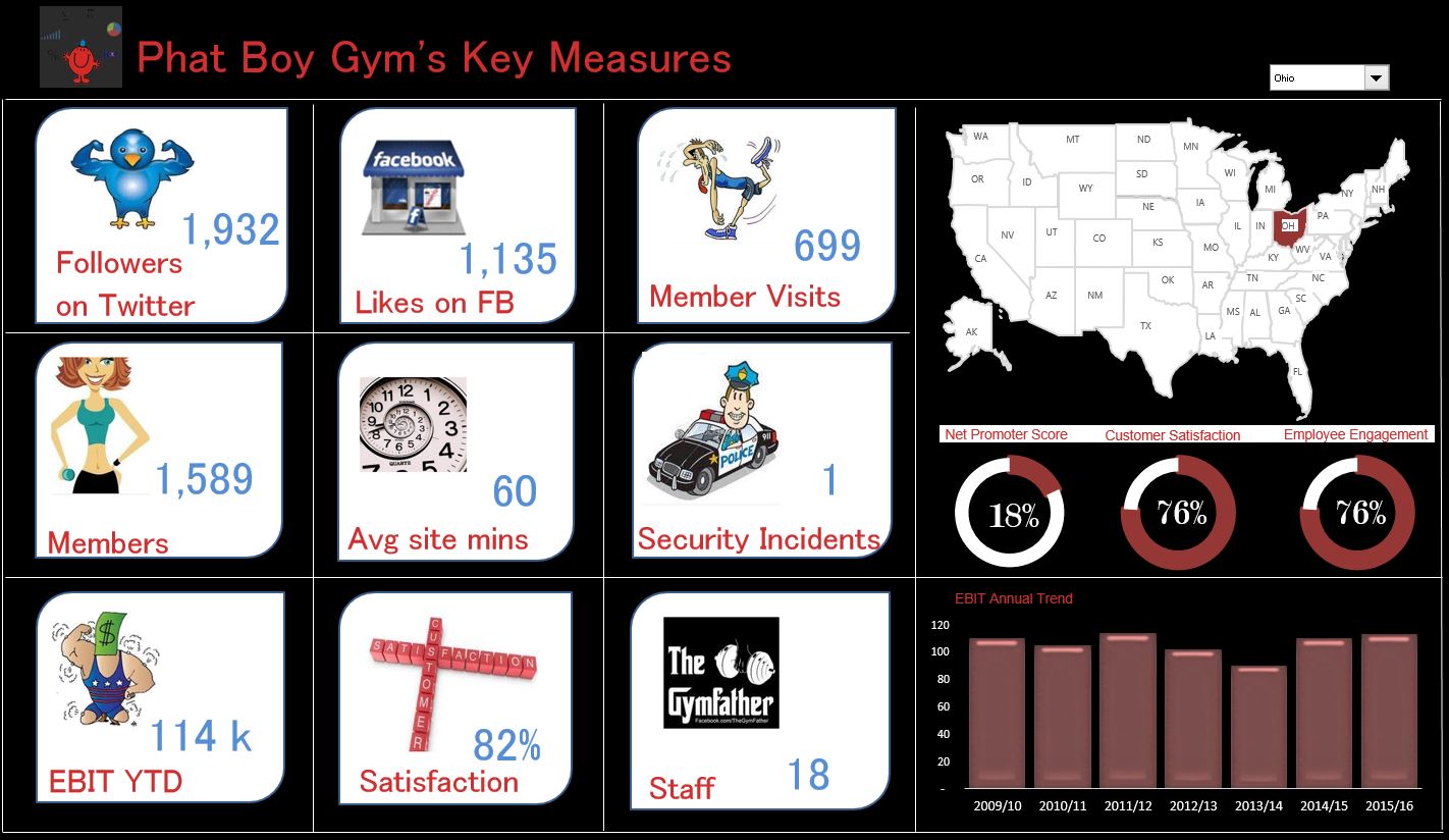
The Key Measures Excel dashboard is an American chain of gyms. Phat Boy's Gym, a fictional gym which shows key metrics for each city. The dashboard displays key information for each location and will change based on the drop down on the top right of the screen.
US States Dashboard
This US Excel dashboard is a sneak peak at population data obtained from Wiki. At the right of the dashboard there is some radio buttons which enables the selection by region. The States are grouped into their regions and as the grouping is selected the State Flags and charts change in accordance with the radio button.
Top 10 Excel Dashboard
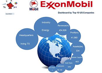
The Top 10 Excel dashboard depicts the top 10 US corporates, highlighting some key common metrics. The design of the body of the Excel dashboard (world) stays the same while the logo changes as each company is filtered with the drop down on the left hand side.
Gauge Excel Dashboard
The Gauge Excel dashboard features a gauge. I once read that the gauge on a dashboard was like the fast food for Excel Dashboards. They take up too much space for the information they provide. However, when you only have a small amount of information to show on your dashboard and that information is important, then there is no reason why they can not be added to a dashboard.
Prior Year Excel Dashboard
The Prior Year Excel dashboard tracks a firms key spending items, plan v actual for EBIT, revenue and expenses. I tried adding just two colours to the FTE chart but it did not look right so I kept the multi coloured look and in this dashboard I think it works.
EBIT Dashboard
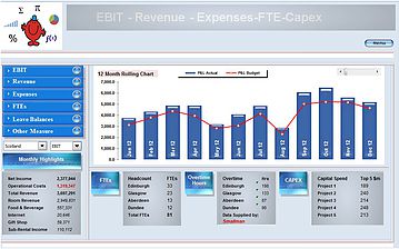
The EBIT dashboard is an example of an Excel dashboard focusing on EBIT. The dashboard has a chart which allows you to increase the data points with the help of a spinner button. It shows EBIT, revenue and expenses by region. Other key measures included in the Excel dashboard are FTE, overtime hours and capital expenditure.
Banking Excel Dashboard
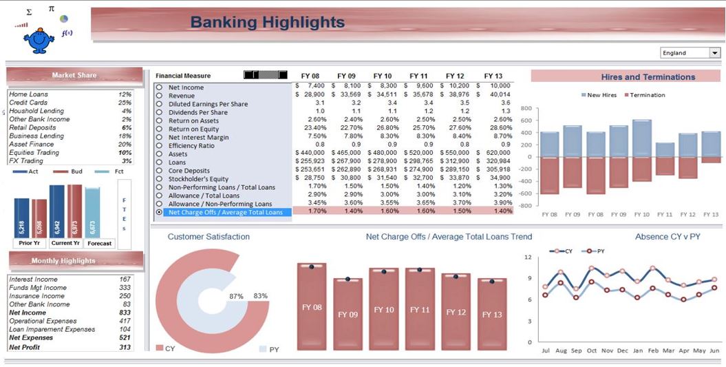
The following Excel dashboard has been used in the financial modelling document. It is an Excel dashboard which outlines Banking highlights. It uses a spinner button to generate projections which are highlighted in blue on the right to indicate that these figures are budget.
Restructure Excel Dashboard
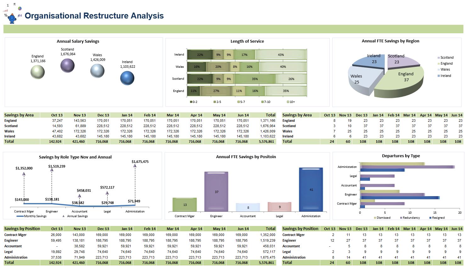
The Restructure Excel Dashboard is predominanty designed around workforce planning and trapping the savings from changing the size, shape and nature of the organisation.
Store Sales Excel Dashboard
The Store Sales Excel Dashboard is a breakdown of staffing numbers by location and cost per FTE. The lower part of the dashboard shows revenue and expenses and there is a drop down at the top left which allows a choice between Europe, Americas and Asia Pacific. This is one of my favourite Excel Dashboards.
Demographic Dashboard
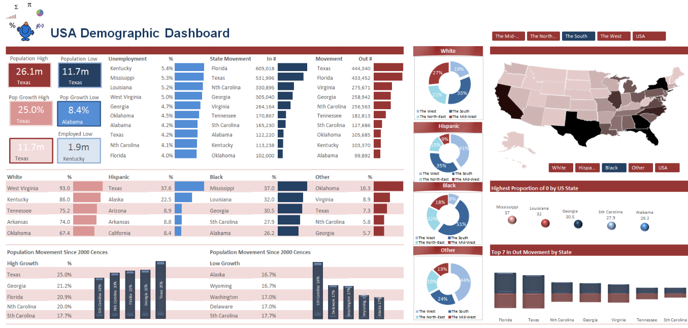
The Demographic Excel dashboard shows demogrphic information for the USA. It introduces a heat map which shows high concentrations of particular demographics, such as race.
National Excel Dashboard
The following Excel dashboard has a heat map of Australia which changes according to the selection made in the drop down. The flags next to the slicer will change based on the selection. The technique for this can be found on the Toggle Chart page. This Excel dashboard will work on Excel 2010 and later.
Consulting Excel Dashboard
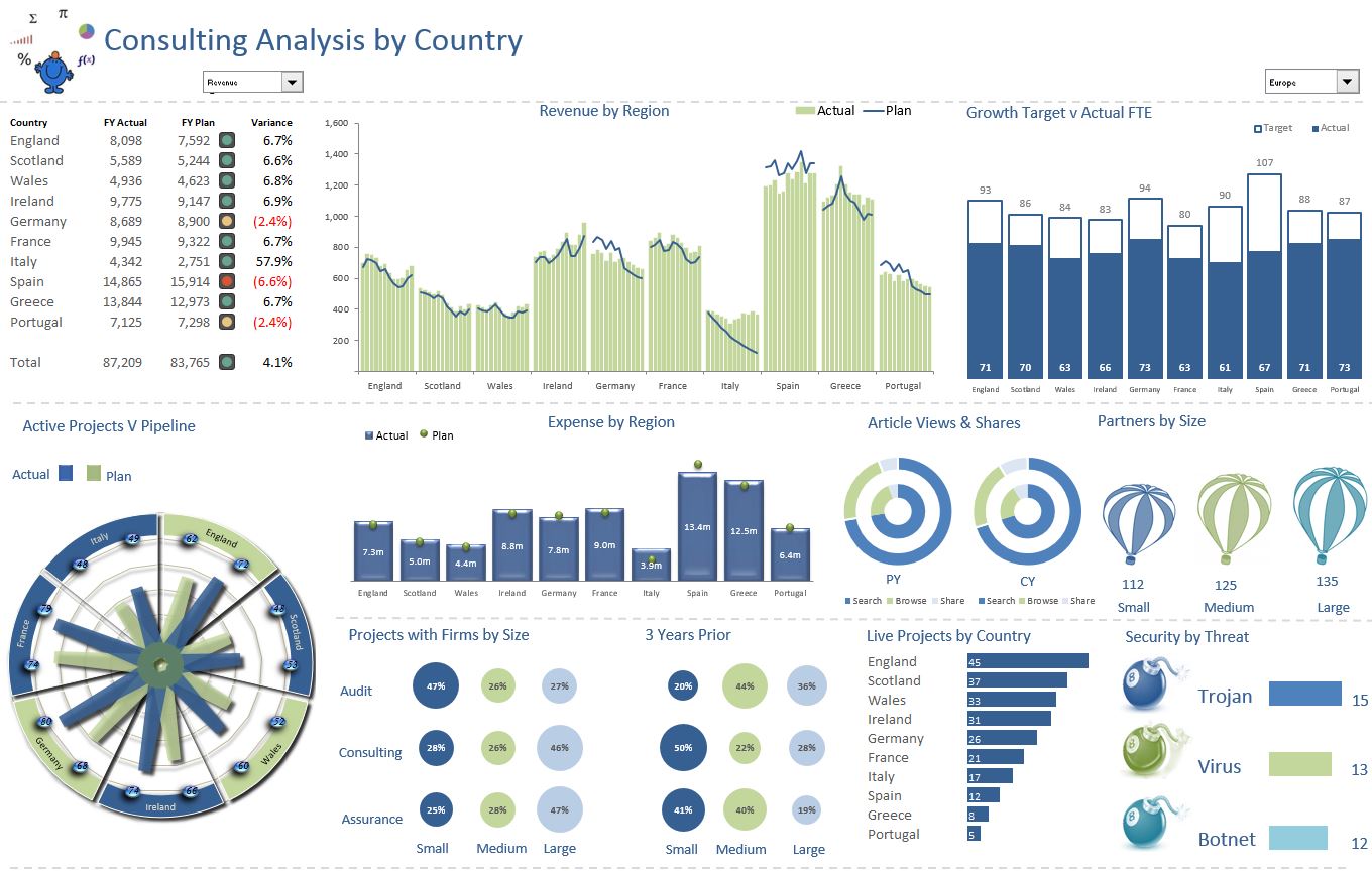
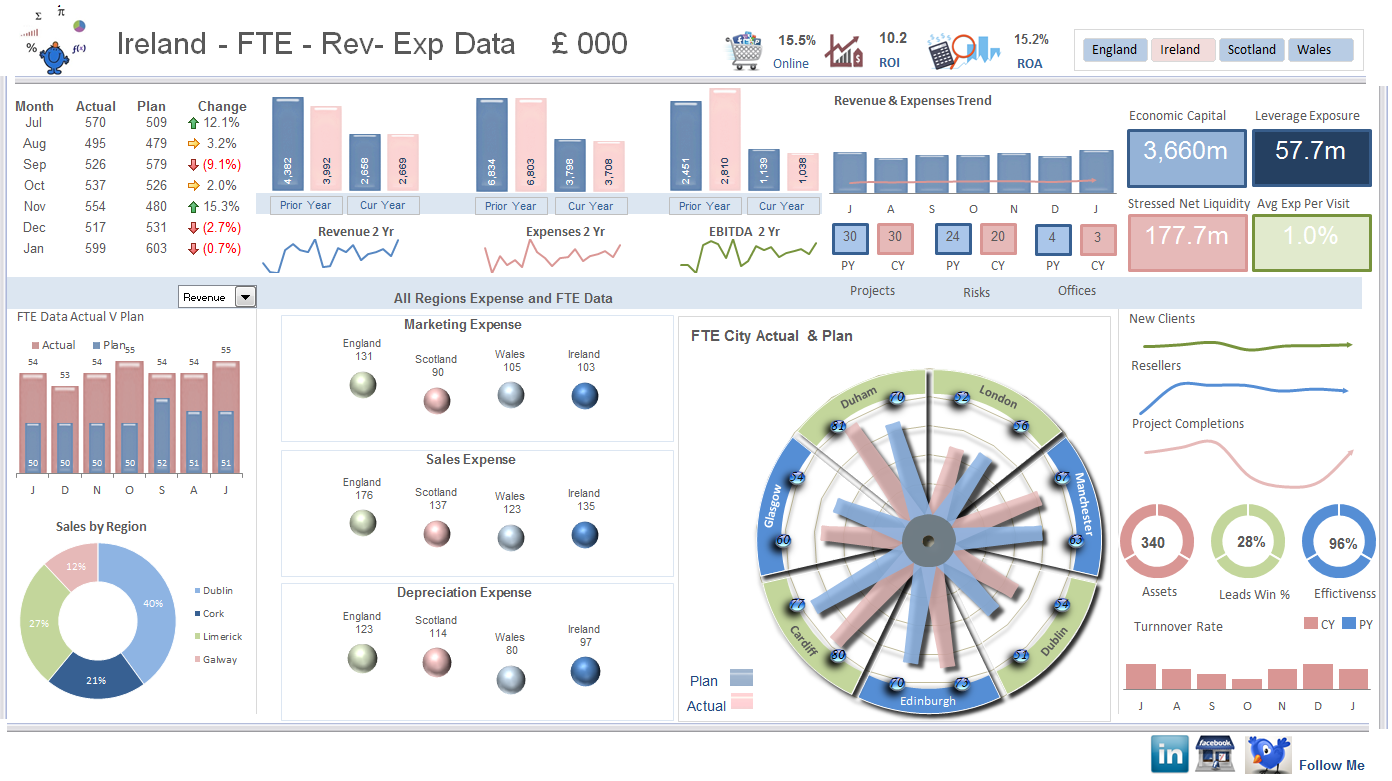
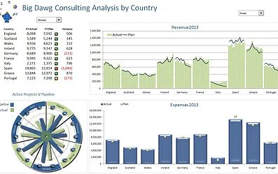
The Consulting Excel dashboard has plan V actual, an interesting radar chart and analysis by region. It uses Excel’s excellent built in conditional formatting traffic light feature. It does not display as much information as some of the other dashboards on the site but I like it for its simplicity and with only two colours (excluding the traffic light feature).
Sparklines Excel Dashboard
The Sparklines Excel dashboard is an interesting one as it has many sparklines and the sparklines are conditional formatting not charts. The file works well as a visual display of each of the metrics being displayed.
World Cup Excel
The World Cup Excel dashboard is a tribute to the upcoming world cup in Brazil. This sort of dashboard is known as a Wall Chart. So it's a world cup wall chart in Excel. You can predict the matches and see who may meet up in the knock out stages of the tournament. This sort of dashboard can be used with any tounament based competion if the methodology which I have used is followed. Enjoy!
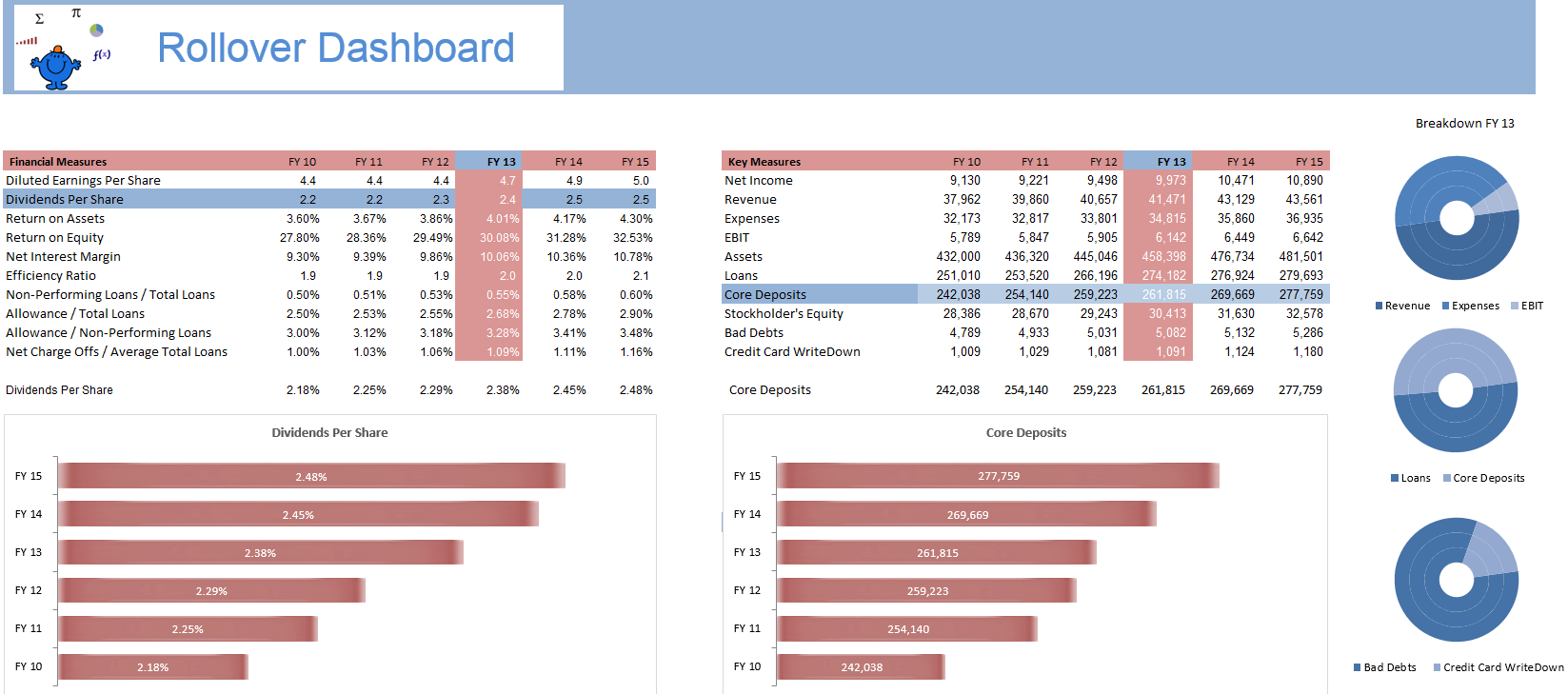
The Rollover Excel Dashboard draws on the article on Chart Hyperlinks which details how to change a chart by rolling over a particular cell. It is a really cool technique which has far reaching implications especially in the creation of Excel dashboards. I have shown a couple of concepts for a dashboard however there will be many many more.
The Overview Dashboard below once more has a rollover feature in the same manner as the above dahsboard. The years in the top right pannel of the dashboard are what change the charts in the dashboard addin the flexibility in the model. Just roll the mouse over a year to see the metrics associated with that year in the dashboard. The article on Chart Hyperlinks might provide some more insight in how to set one of these Excel dashboards up.
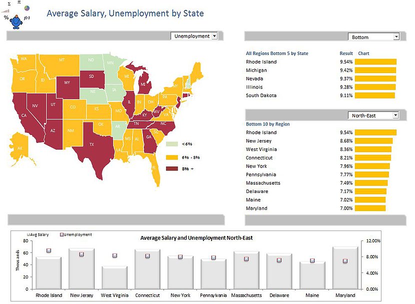
The Heatmap Dashboard is a breakdown of salary and unemployment information in the USA. The charts on the right of the dashboard are spark lines and will change colour with the change in the combo box on the top left. The heat map of the USA will change colours based on the selection of the drop down above the map of the USA. The dashboard displays top and bottom 10 metrics by state by region.
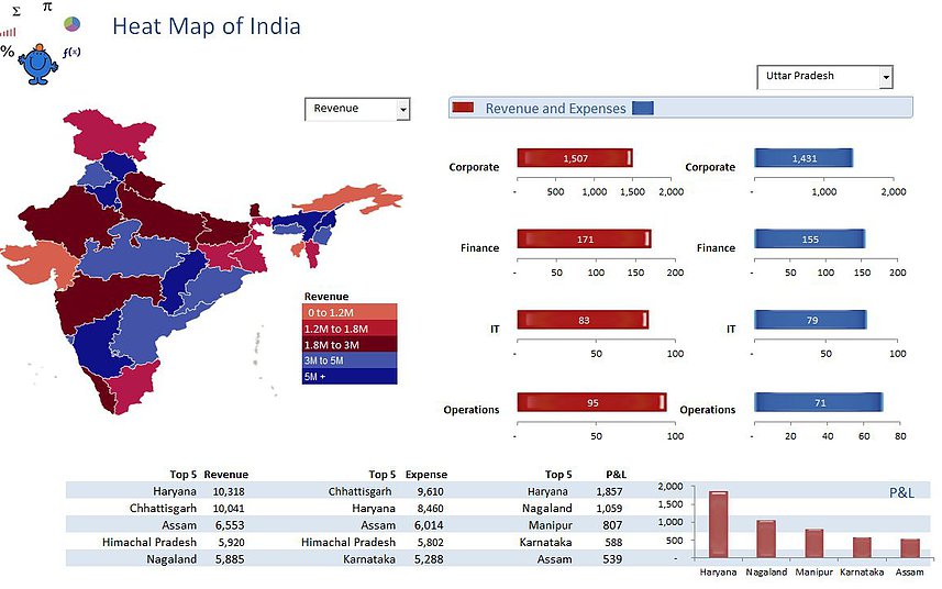
The India Heat Map Dashboard is an Excel dashboard which displays a heat map of the states of India. The dashboard dsplays revenue and expenses by type and by State. The dashboard also has a break down of the top 5 revenue, expenses and profit by State. It is quite a simple Excel dasbhoard and should be easy to follow.
The England Heat Map Dashboard is an Excel dashboard which displays a heat map of the regions in England. The dashboard dsplays age group metrics, house price, income and life expectancy data. The dashboards spins on a combo box beside the map of England. The colours in the heat map part of the dashboard change with the combo box.
The HR Excel Dashboard is an Excel dashboard which displays some common human resources metrics. The dashboard has a couple of combo boxes which allows selection by region and department. It is an Excel 2010 dashboard so you will need a later version of Excel to see the files full functionality.
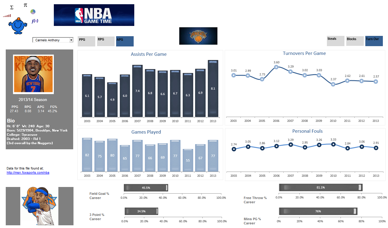
The NBA Player Excel Dashboard is a dashboard which shows some of the current batch of NBA starts and their statistics. It is an Excel 2010 workbook with a couple of macros to show change the colour of each of the active tabs. These tabs control the charts on the dashboard which display stats like points per game, rebounds per game and steals per game. I enjoy the NBA so this dashboard was a bit of fun.
The School Excel Dashboard is a dashboard which shows plan v actual for a number of shcools across disciplines. It is an Excel 2010 workbook which uses a slicer to flick the dashboard between schools to show performance. The dashboard shows data by disipline and shows the trends on spend over a one year period. You can see the peaks and troughs. There is some coding behind the sheet but this is only to speed up the data input. I will leave the coding in the worksheet in case people find this useful. People are added to schools on the staff sheet. The input sheet acts as the control tab where data is entered into the back end database.
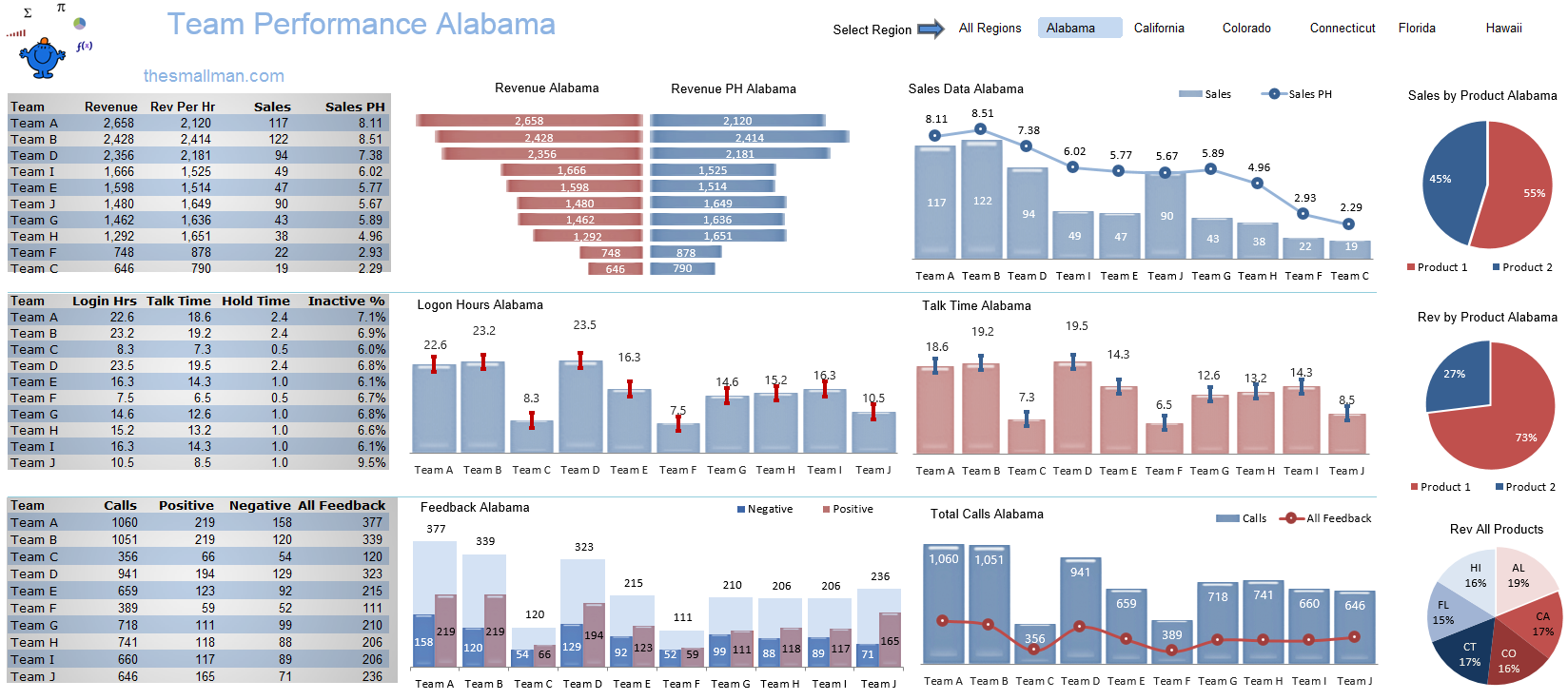
The Team Performance Dashboard is a dashboard I created as a submission to the Excel Forum Dashboard competition in November 2014. The competition was open to all with a first prize of an iphone 6. There were 119 entries in the dashboard competition. It was enjoyable putting together this Excel dashboard, I did not win but I did get a page dedicated to this dashboard on ExcelTip.com
I have recently updated this dashboard to include a few new elements, an additional chart and I have streamlined the colour scheme.The Sales Person Excel Dashboard is a dashboard which traps sales person data by State based on Australian States. There is quite a bit of information on the Excel dashboard. The dashboard has 5 static charts to show the overall sales position and 20 dynamic charts which are based on the slicer at the top of the dashboard which spins on year. Apologies to Tasmania and the territories for the no show on this dashboard.
The Road Traffic Statistics Dashboard is a dashboard which captures traffic statistics in Australia over a long period. The raw data came from the Australian Bureau of Statistics.
www.abs.gov.au
It is the government body here in Australia which looks after the collation of society demographic and other data related to life in Australia.
The dashboard presents an all too real picture of the age, sex and vehicle type of all fatal accidents recorded over a 7 year period. One of the positives is that traffic fatalities seem to be falling. A slicer at the top of the dashboard allows you to generate a report by State or by year. There are high level charts, charts showing speed statistics, vehicle involved in fatality, month and time. The data is not complete on the ABS site however I have tried where possible to keep the data as close as possible to actual figures.
The Global Sales Dashboard is a dashboard which captures sales statistics for a fictional company. This Excel dashboard uses an Excel heat map to highlight each of the regions. It uses 5 colours, one for each region. There are some option buttons to show data by year at the top and option buttons on the left to set the focus of the dashboard on a specific region. The map will change colour to reflect the region in focus.
The chart on the lower right requires Excel 2013 or later to ensure the labels work as intended. At this stage I have not published this dashboard. It will be the focus of a CPA course and I will publish the dashboard after this course is complete.
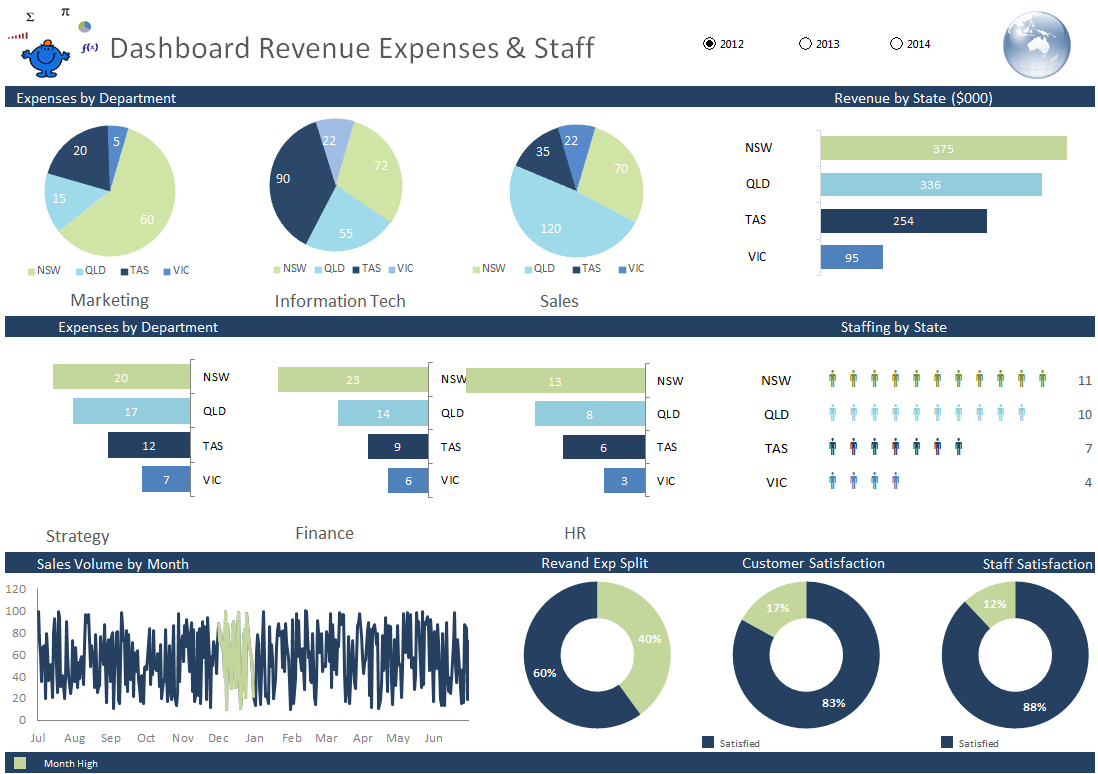
The Rev Exp Staff Dashboard is an Excel dashboard which captures expenses by State and department, revenue and national staffing levels. The dashboard spins on year and has 3 years as an example. It has a very nice staffing chart and a consistent colour throughout.
Click on the above image and it will take you to the file in themallman blog.
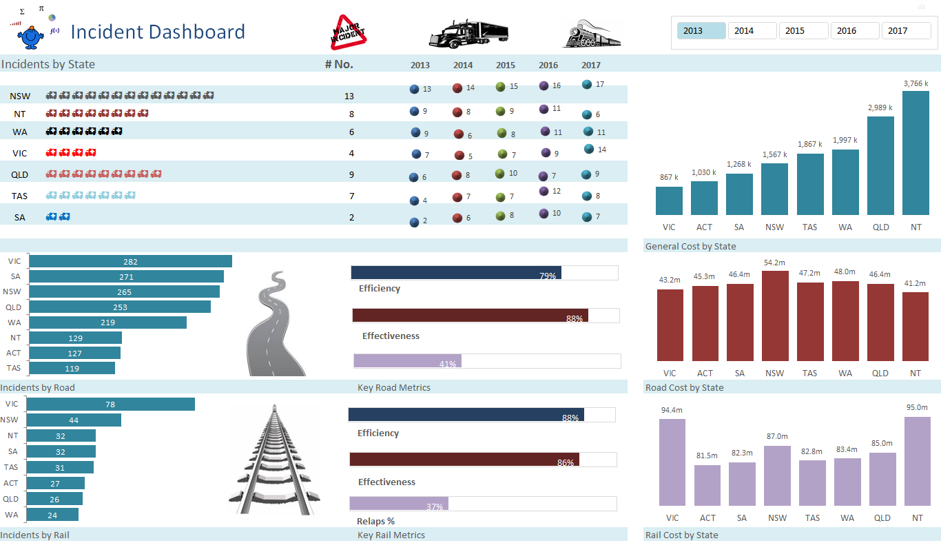
The Incident Dashboard is an Excel dashboard which is quite small but captures some important metrics. The dashboard uses the same in cell technique for charting incidents as the prior dashboard. In the blog post I will give some examples of in cell charting using the Rept formula. It would be nice if the picure library were enhanced a little more but it is what it is at this stage.
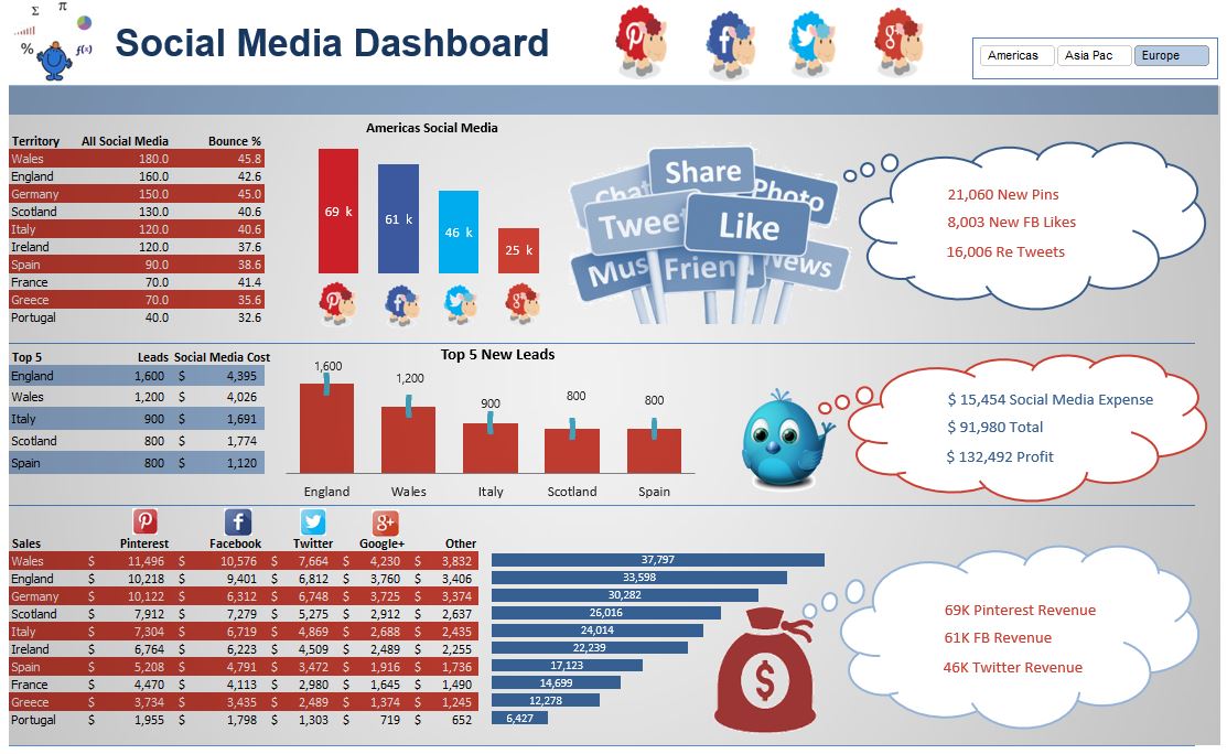
The Social Media Dashboard is an Excel dashboard outlining social media activity for a company. It focuses primarily on Penterest, Facebook, Twitter and Google Plus. Apologies to other social media outlets.
The dashboard can be found in my blog as the menu from my site has become too full to add this to the dashboard section.
The above link will direct you to the blog where the files lives.
KPI Excel Dashboard
The following files are not available for download. I have completed these for CPA Australia and this is an ideas area for those interested.
The above is a little diddy I did for CPA Australia. It is a KPI dashboard which outlines some broad areas within an organisation. To give the dashboard a bit of pizazz I added some appropriate (I think) pictures. Enjoy.
Global Banking Dashboard
While the above Excel Dashboard is the result of the CPA Australia Big Data webinar series. It is the culmination of a 3 part series focusing on articulating big data in a visual way. IT is quite a detailed way to bring large amounts of data to a micro Excel Dashboard report.
This is my latest creation for one of my courses. I will pull this together with one of dashboard videos. Look forward to using it with my students in mind.
This is a full day training course I use as the output from a large dataset. It takes current year and prior year sales and compares the sales against one another. The dashboard is entirely created in Excel with a PowerPivot back end as its source.


