
India Heat Map Excel Dashboard
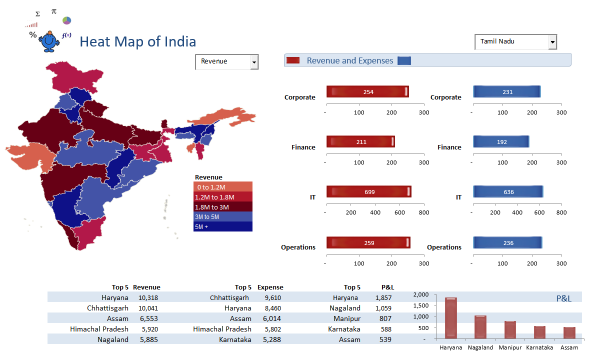
The following Excel dashboard will change the colour of each of the states of India dependent on the value selected in the combo box next to the map of India. The Excel charts on the right of screen are linked to a combo box which isolates revenue and expenses by State. It is a relatively simple dashboard to put together and displays a heat map for to add context to the numbers in the report. The data in the charts shows a comparison of revenue and expenses by department which is a common thing to show in any Excel financial dashboard. All in all it is the start of a dashboard and could be used to generate ideas and to get a feel for the numbers.
These types of reports can be highly effective in outlining over or under performance in a region. A description of this method can be found at the following Heat Map in Excel.
For a listing of all Excel Dashboards on the Smallman.com visit this link. There are more Excel files than you will be able to view!!
The following is the file which contains the above excel dashboard with its supporting data.