
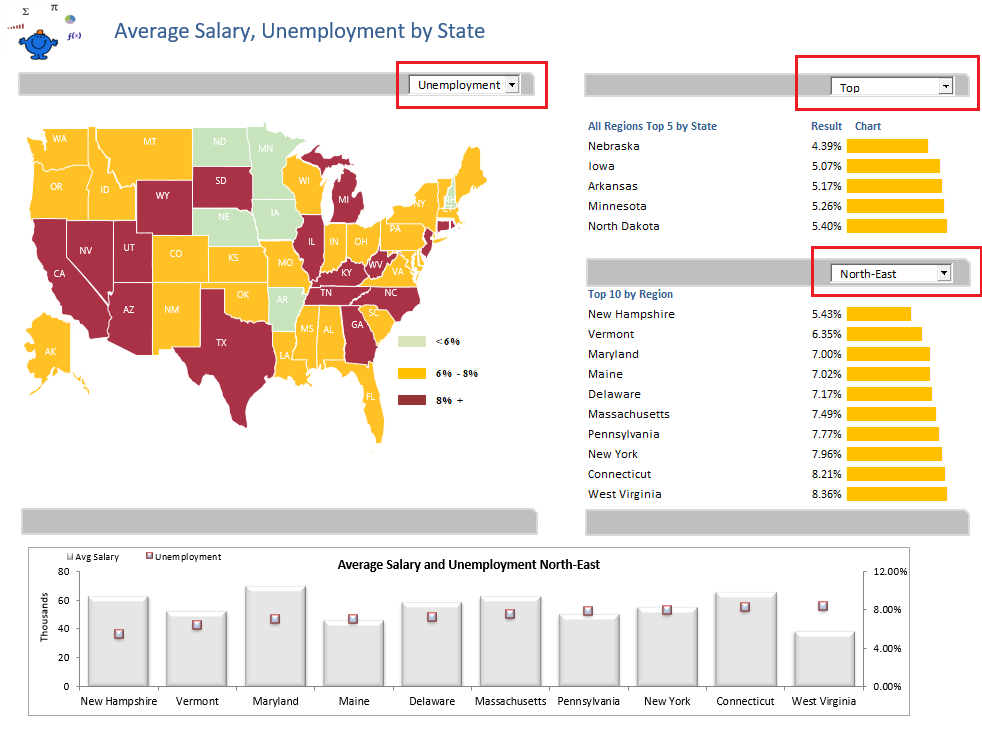
Heat Map Excel Dashboard
The following Excel dashboard will change the colour of each of the USA States dependent on the value selected in the drop down. The charts on the right of the screen will also change colour with the selection above the map of the USA. This is a heat map technique which uses VBA to change the colours of each State in the map. A description of this method can be found at Heat Map in Excel.
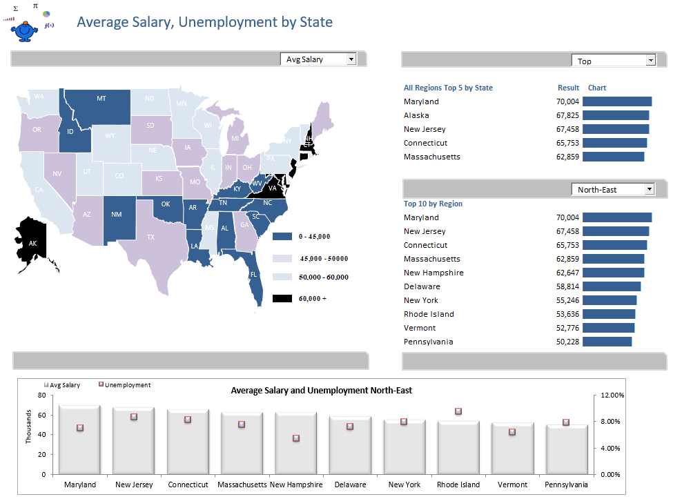
By changing the drop down on the left the dashboard will change completely. The map of the USA will change and the charts on the right in the dashboard change as well. The map is changed with excel VBA and the charts on the right are changed with conditional formatting. They are not charts at all but smart use of conditional formatting. Another excel dashboard showing this method to overkill proportions can be found in the Sparklines Dashboard.
For a listing of all Excel Dashboards on the Smallman.com visit this link. There are more Excel files than you will be able to view!!
The following is the Excel file which has the above Excel dashboard and the supporting data. Please NOTE: This file is uploaded with a third party app as its format is XLSM, some firewalls prevent access.
