Organisations can obtain a high-level overview of the company with dashboard reports. Excel is a great tool for creating robust dashboards that may offer managers fast alerts, analysis, and insight. You may discover a wealth of information, templates, tutorials, downloads, and examples using Dashboards. Several crucial phases are involved in creating an Excel dashboard these include:
Specify your audience and purpose:
Determine who will utilise the dashboard and what data they require. Recognise the main queries it should address.
Collect Information:
Gather pertinent information from multiple sources (spreadsheets, databases, and APIs). Make sure the information is current and accurate.
Select KPIs & Metrics:
Choose the metrics and Key Performance Indicators (KPIs) that will provide you the most information about the goals you wish to monitor.
Create Your Calculations:
Lay your data out so it can be easily summarised. The source data should be in a tabular form which allows the calculations to be created easily.
Create the Layout:
Arrange the visual design. Arrange components rationally, aligning charts and graphs for clarity with grids. Set important metrics as priorities so they stand out.
Produce Illustrations:
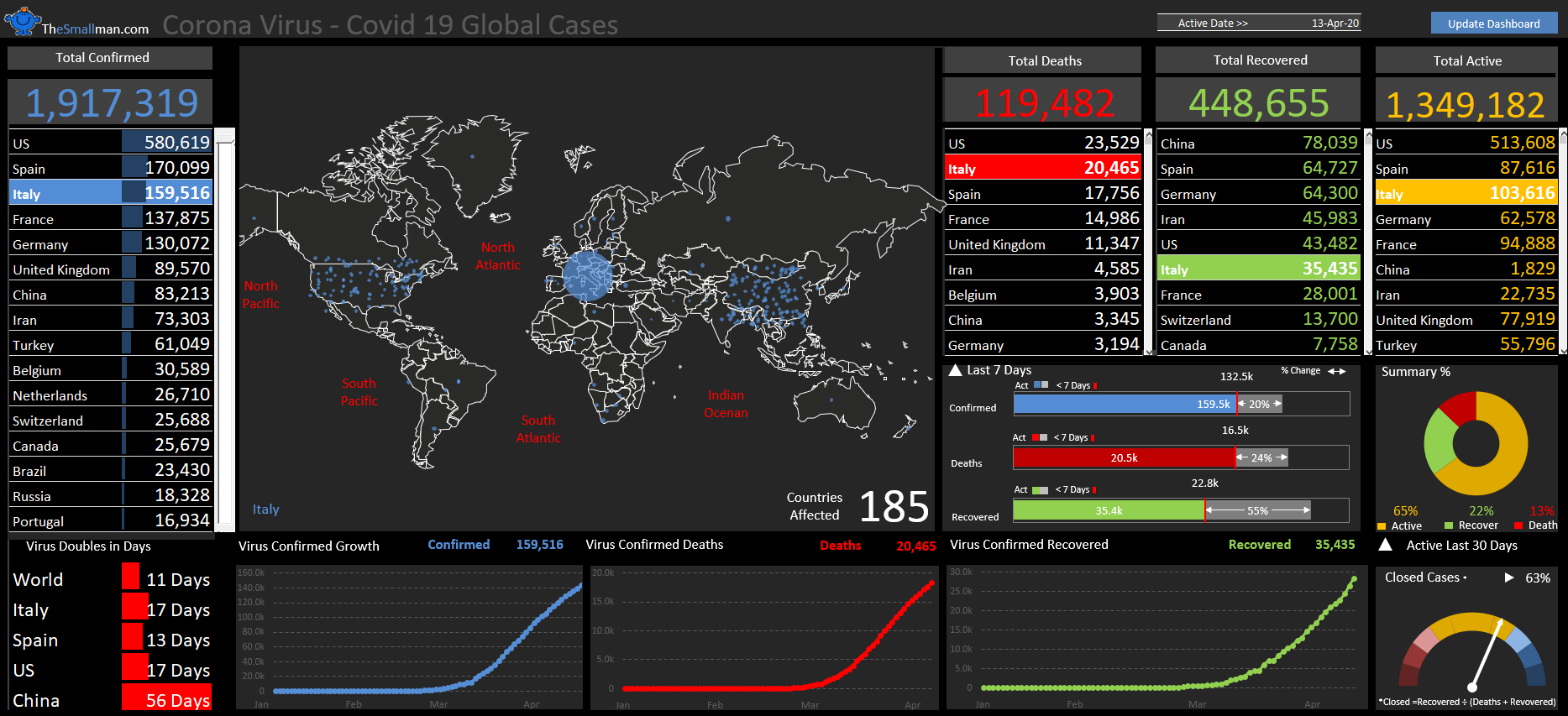
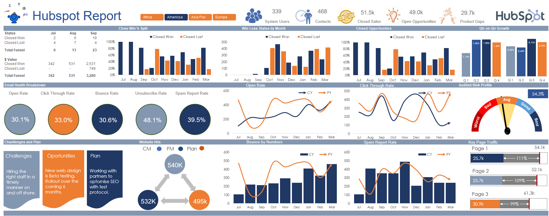
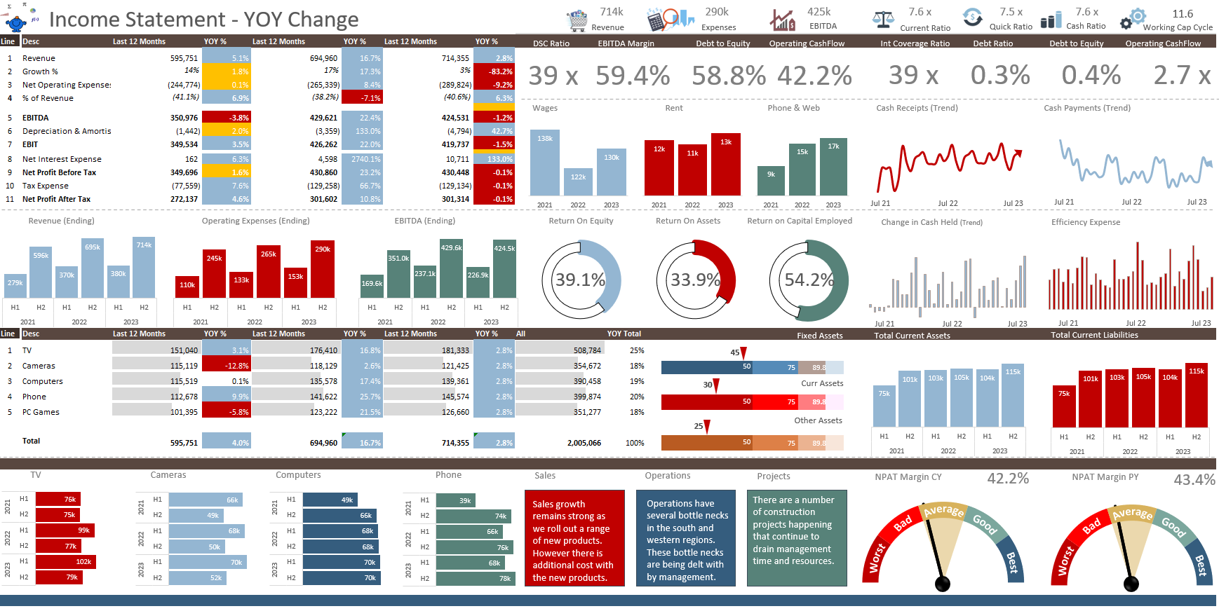
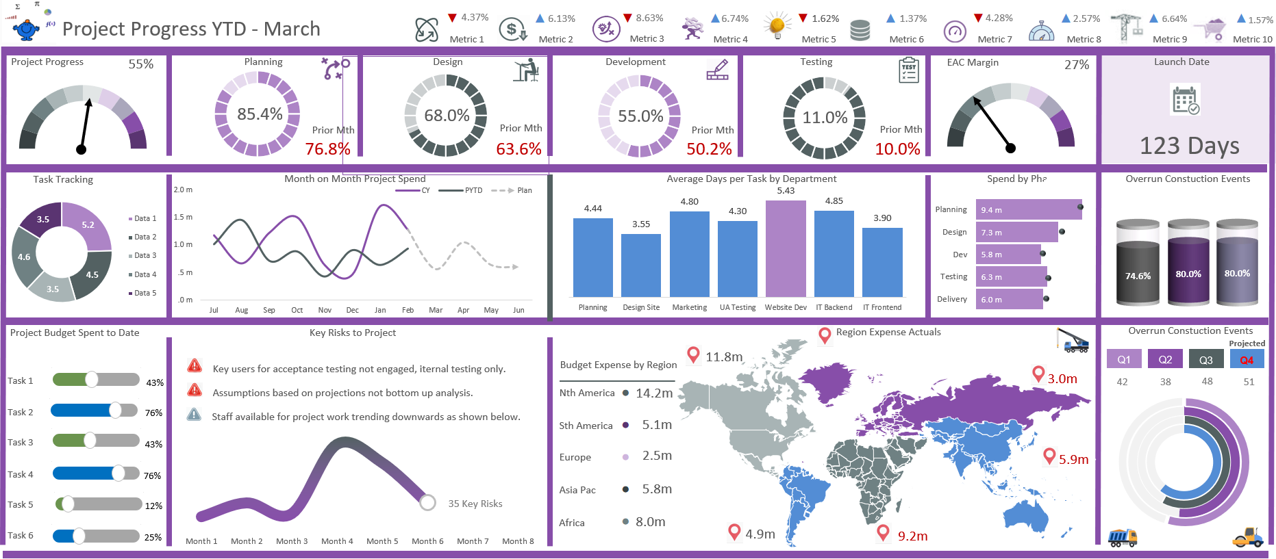
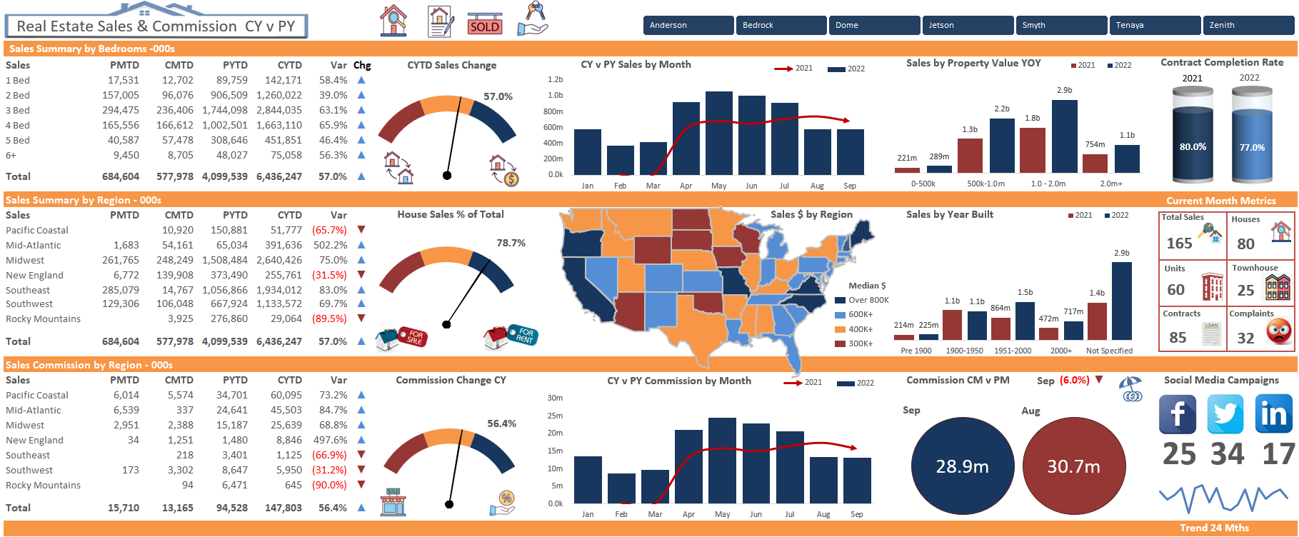
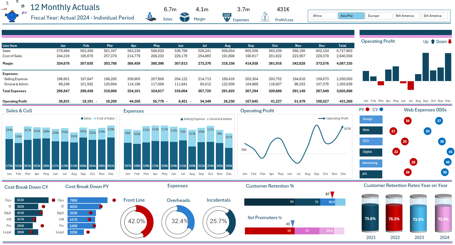
Use charts, graphs, and fit them all on a single page. The following is an example of a 12 month dashboard by region.
Many other examples can be found on the dashboards page. You will see there is a wide range of ways to present data in all its forms.