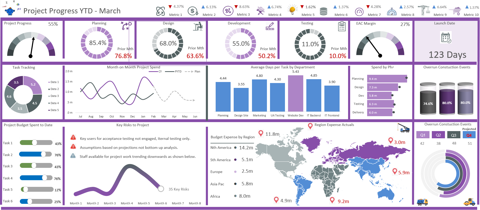
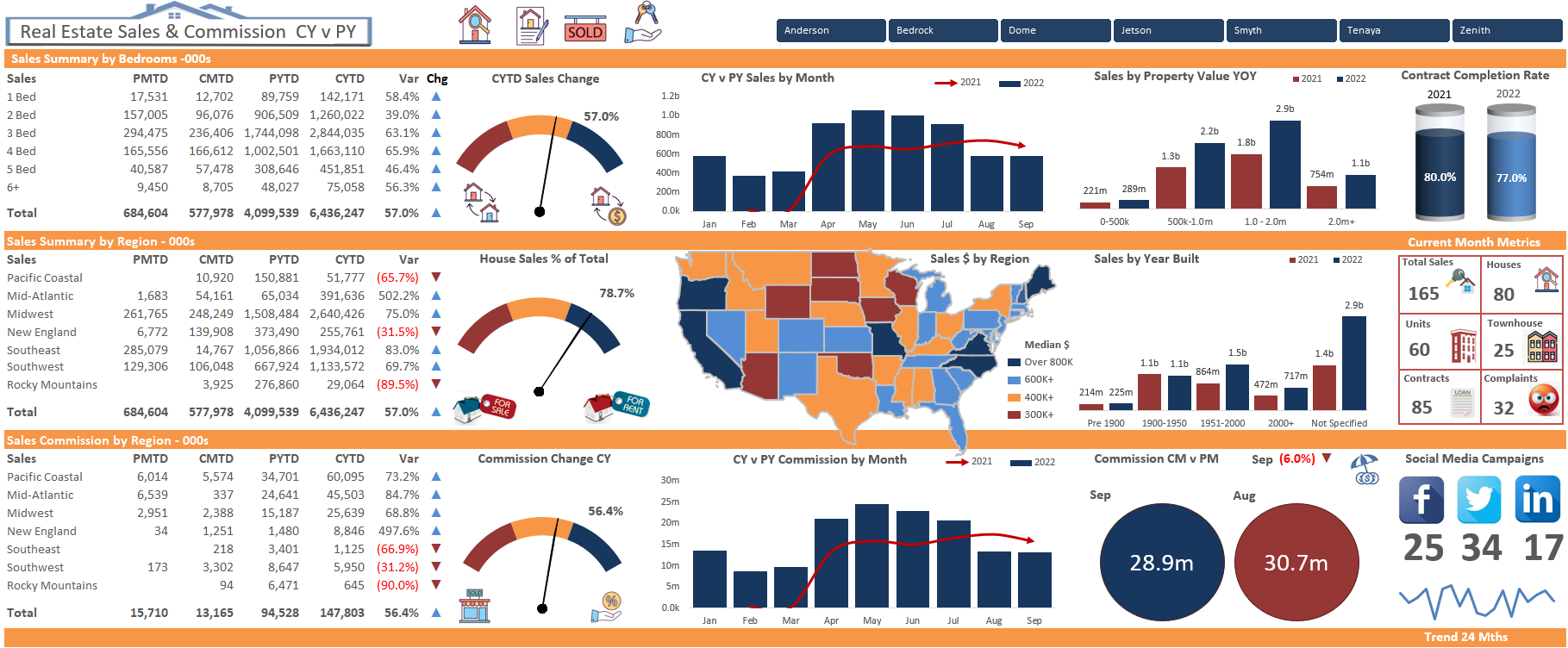
The following Excel dashboard is a trending dashboard which highlights some key organisational metrics by city. As the data is displayed by city I thought I might present the data with some infographics around the cityscape relevant to each city.
The Excel model contains both the raw data and calculations for each of the cities the organisation operates within. It was an enjoyable model to put together.
Some of the areas covered in this Excel dashboard include
Revenues
Expenses
Projects
Risks
Return on Assets (ROA)
Return on Investment (ROI)
Footfall
Leads
Turnover
Efficiency
Net Clients
The model is mostly a trending model with less detail than the larger Excel dashboard models on the site.
The image above gives a closer look at some of the details and shows more of the trends. Ideally the data would have numbers but that is easy enough to add. This was a bit of fun and looks the part in my opinion of course.
The model is spun on a monthly combo box and will concertina based on the month chosen. This gives the dashboard the ability to go forward or backwards and have the charts snap to the month shown in the combo box.


