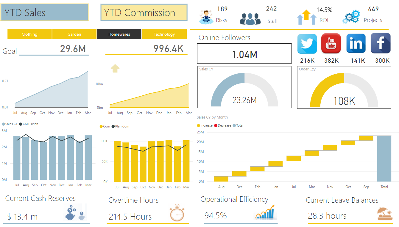
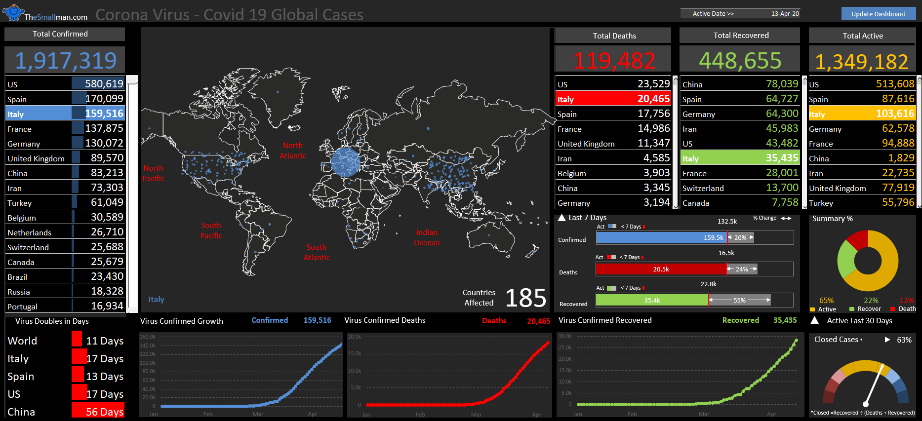
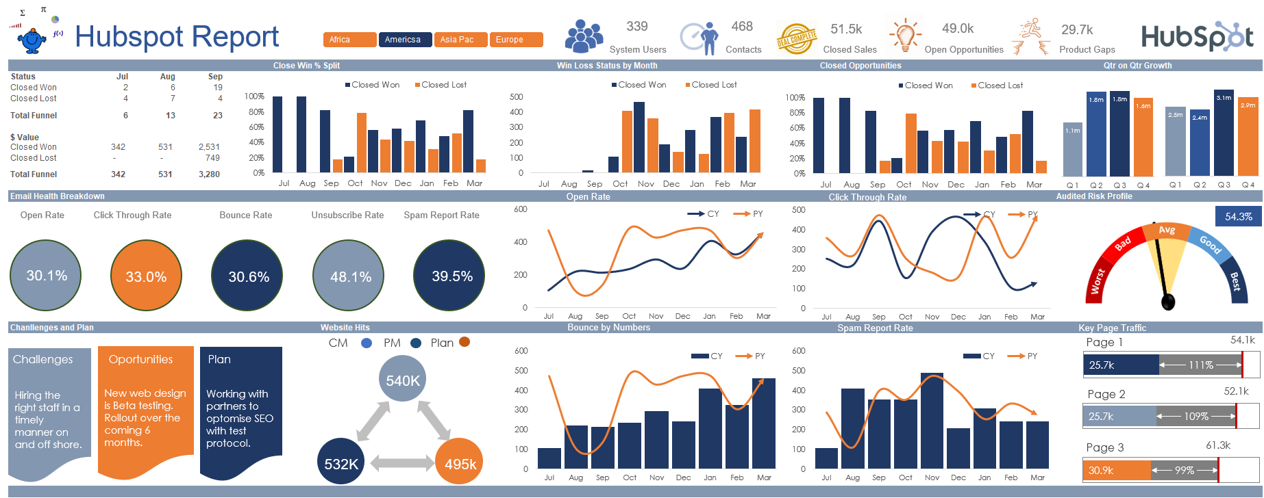
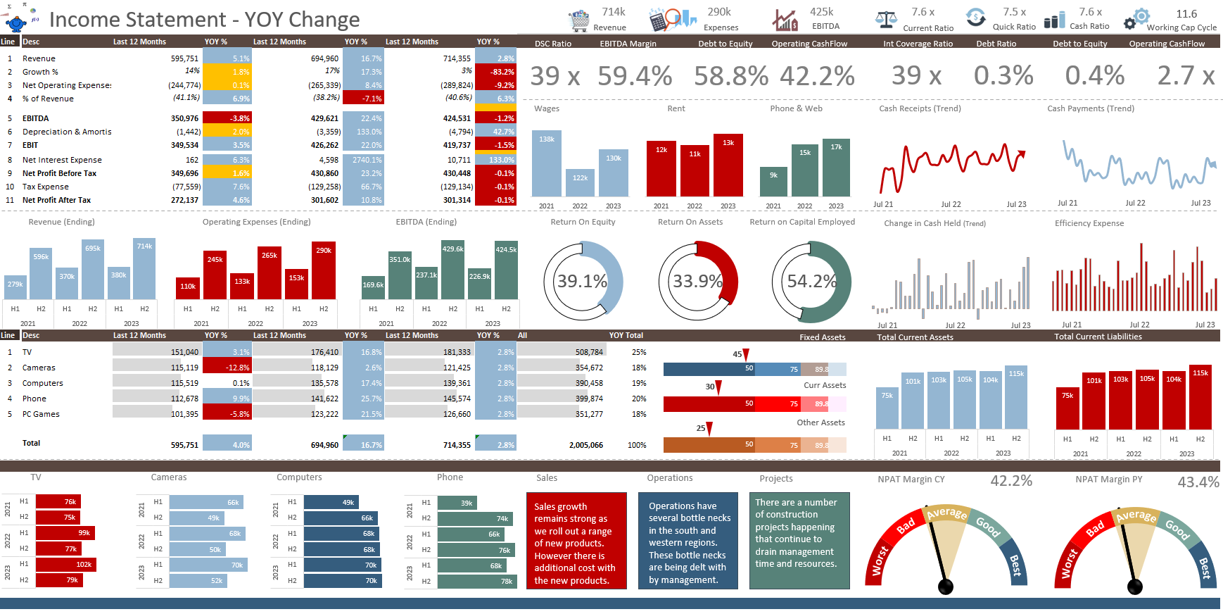
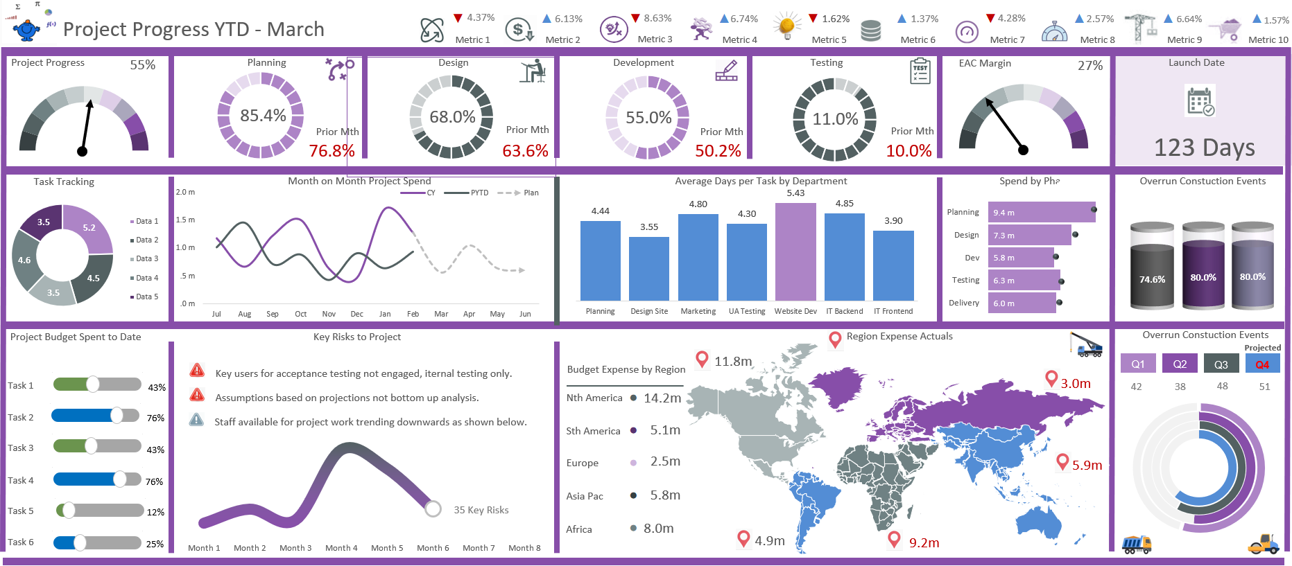
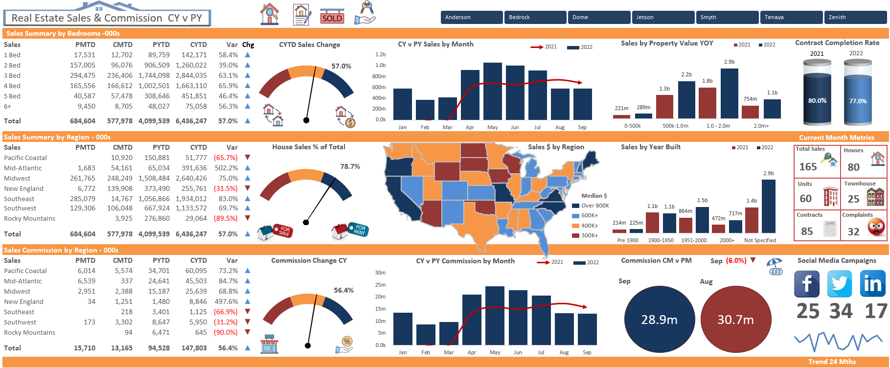
Never been a big fan of the limited space in Power BI desktop. Always loved the rampant flexibility of Excel, want an extra row in your dashboard – ADD IT, want an extra column – ADD IT. The space time continuum limitation has always irked me. So it has come to pass that I find it very difficult to find anything that is spot on where it comes to a good looking Power BI dashboard. I had some time on the plane to Melbourne yesterday and threw this puppy together. It still struggles when attempting to fill the space nicely and I can see opportunities to include more but for what it is the dashboard looks the part and tells a compelling story.
Wonder if anyone else finds the same thing with Power Bi. It seems there is less opportunity for beautification than a meagre Excel spreadsheet. One place I have found that produces some weapons grade quality Power Bi Dashboards is Data Bear.
You won't be disappointed as they seem to be on point with their Power Bi models. Enjoy.
