Change Chart Series Colour
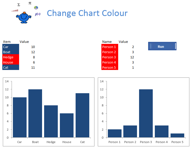
Changing the chart colour based on the colour of a range can be used to to highlight a condition within a chart. In the following example I will add a colour to a chart series name after the procedure has been executed. The items which have a value 10 or greater have the colour blue and the items lower than 10 have been assigned the colour red. I changed the colours slightly in each chart for effect.
After the procedure has run then charts look like the following. Any item 10 or above is highlighted with the colour in the
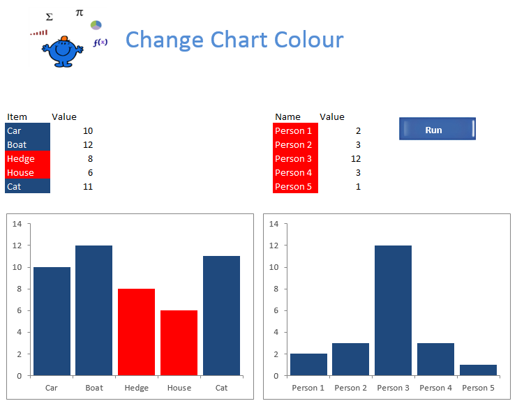
You will notice the Hedge and House are in Red in the first chart while person 3 is blue in the second chart. The following is the code which will loop through all of the charts in the active worksheet and change the colour of the chart series based on the colour of the series name.
Sub ChangeColour() 'Excel VBA change chart colour.
Dim rng As Range
Dim str As String
Dim j As Integer
Dim i As Integer
With Sheet1.ChartObjects(str).Chart.SeriesCollection(1)
An important point to note is this procedure will not work with conditional formatting. If you want to add colour to the cell which make up the chart series then one way to do this would be to loop through the range or apply an autofilter on the range and colour based on the results of the loop or the filter. As the ranges are small here is some simple looping code which will colour the cells which are greater than or equal to 10.
Dim r As Range
Dim rng As Range
Set rng=[B10:B14]
The above cover just the first range in the file but can be adapted to your data. There is a similar article using a different technique to make chart series stand out here Change Bar Colour.