Excel Change Chart Bar Colour
Creating a chart which focuses on a particular item in the chart by changing the colour is a all about how the data is structured. This article will show you how to do this in a simple example.
The idea is to have the item chosen in the data validation list show as NA in the original list and have a secondary list which produces a value for that selection and NA for all of the other selections. Then add a series to the chart which includes the list will all of the NAs plus the value in the drop down. The graphic below gives a visual example. This method is shown in more detail in this Sales Dashboard.
The way to set the file up is to create two lists both with different formula. The list called value has some formula which looks like the following:
=IF(B7=$F$6,NA(),K7)
B11 contains the Value Apple and F10 is the purple cell with the drop down above with the word lemon in it. So if the values are equal put NA in the Value Column.
In the Focus column there is a VLOOKUP formula:
=VLOOKUP(B7,$I$7:$K$13,3,0)
The formula is looking up the description column and there is a second list which replicates the list above the chart. One column in this list does the opposite of the value column above. It looks at the descriptions and will only show a value for the item in the drop down. The rest of the items will be NAs. The vlookup formula looks for the item with a value in this list and returns the only value in the focus column.
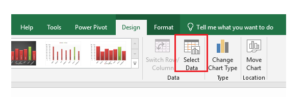
Now set up the secondary series in the chart. Right click on the chart and choose select data. Or choose Select Data from the Design menu.
Now select Add from the list:
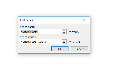
Choose the Series Name which is Focus and select the Series values. These are the values in the Focus column.
Now just ensure that the colour of the chart series is different to the colour of the Value series. There is a slightly different technique with the use of VBA which does much the same thing in this article Change Chart Series Colour.
The following file shows the technique's workings.


