
Creating a Waterfall Chart
Waterfall Charts have become popular recently - particularly where I work. They are useful for showing the movement between two points. Revenue and the Costs associated with generating that revenue to produce an end position - EBIT. They can be used to show the difference between two scenarios or how the numbers changed between scenario A and scenario B.
The following is an example of a very simple waterfall. It is really easy to update; simply change the headers, the figures and the chart should take care of itself. I use this one whenever I need a fast waterfall that has to be done 'yesterday'. I have found some waterfall chart examples difficult to update and follow but this should allow everyone to produce waterfalls quickly and easily.
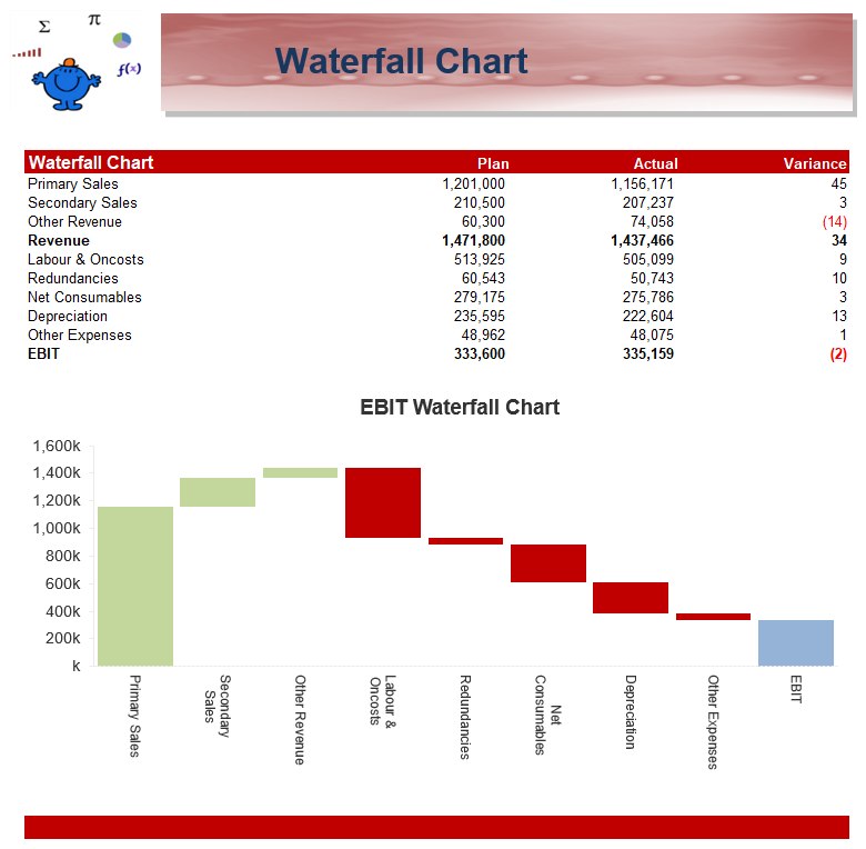
The Chart is essentially a stacked Bar Chart with the lower part of the chart made the same colour as the chart itself. So the white area underneath each of the coloured areas is a chart too, it is just that you can't see it. The Colours in the Chart are not created automatically which is a pain if you have a list which will change constantly. Fortunately for a P&L style chart like the one we have above all items in the P&L will fall into one of the shown categories so the categories will remain static.

The following is an example of presenting the difference between an EBIT at a point in Time and EBIT at one point in time. Handy for showing the difference between two versions of a corporate plan, Budget first cut and Budget second cut.
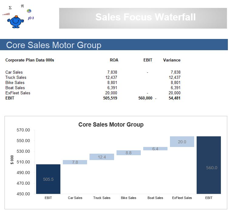
The formula which sits behind this version is a bit more complex but it should just be a matter of substituting your data for the data which is contained within the file. The following Excel file shows the above Waterfall chart example. Use it as a template.
Waterfall for Negative Values
The process of including negatives in a waterfall is a little more involved. The ups and downs below zero need to be considered in the formula that drives the chart. The following is an example of the figures going below zero.
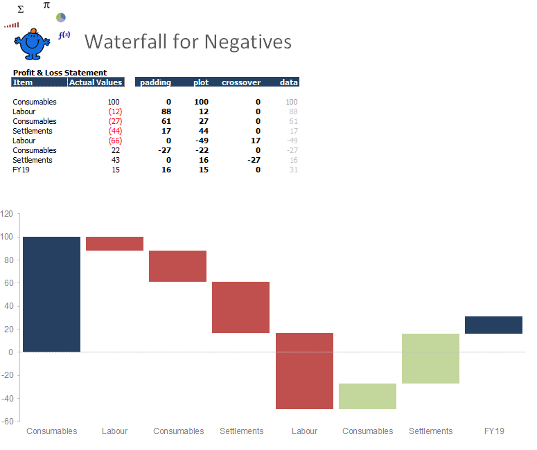
The above is another example of a waterfall chart in Excel. This time the waterfall is for negative values. These type of charts can be very useful. In Excel 2016 there is an inbuilt waterfall chart so these are handy for earlier versions in Excel.