
Group Items in Excel Chart
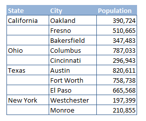
The following is an article on grouping like items in an Excel chart. In essence having a parent label in the X axis (bottom axis of a column chart) and its associated child. The way to do it is all about how you set up your data in Excel. If you separate the elements in the data set, the chart falls neatly into the format we are trying to achieve. The following is an example of the data table and how it needs to be set up.
After the table is set up in a specific format, as the table is set up above, simply highlight the table and select the Insert Menu for choosing your Excel chart. In the following example we will choose a column chart.

On the Insert Menu - Choose a column chart and the 2D Column. It is the first chart in the list of column charts. This should produce the following chart (with more generic colouring).
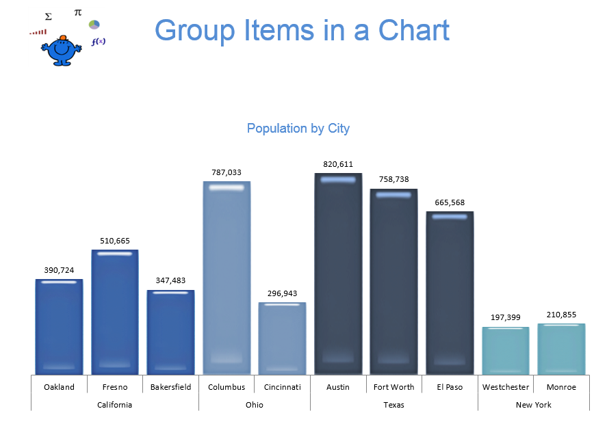
Each of the items are separated into the categories for the state. The data looks a little more structured with the State below each of the cities rather than having 10 cities at the bottom of the chart. The following Excel file give you a sample, just like the above.
