Company KPI Dashboard Model - by Department
Company KPI Dashboard Model - by Department
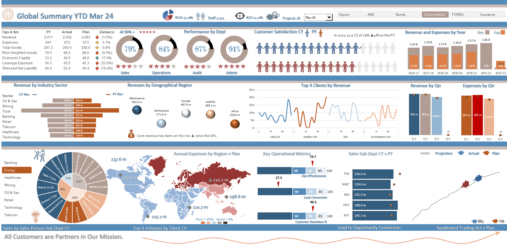
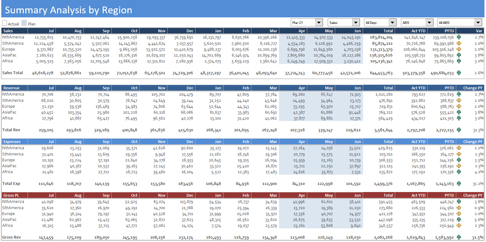
A global dashboard that has a range of metrics on a single page. Track revenue and expenses month and ytd against prior year and plan.
The report summaries a broad range of financial and non financial data in a succinct one page summary. The report compares actual to plan to prior year data for the following Revenue, Expenses, Total Assets, Risk-Weighted Assets, Economic Capital, Leverage Exposure, Stressed Net Liquidity and provides a variance to plan with traffic light effects to compare performance. Additionally the report considers staffing trends, ROA, ROI. There is a broad focus on revenue and expense by industry sector and the model incorporates some innovative charting solutions in the final output.
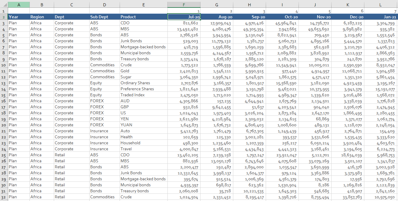
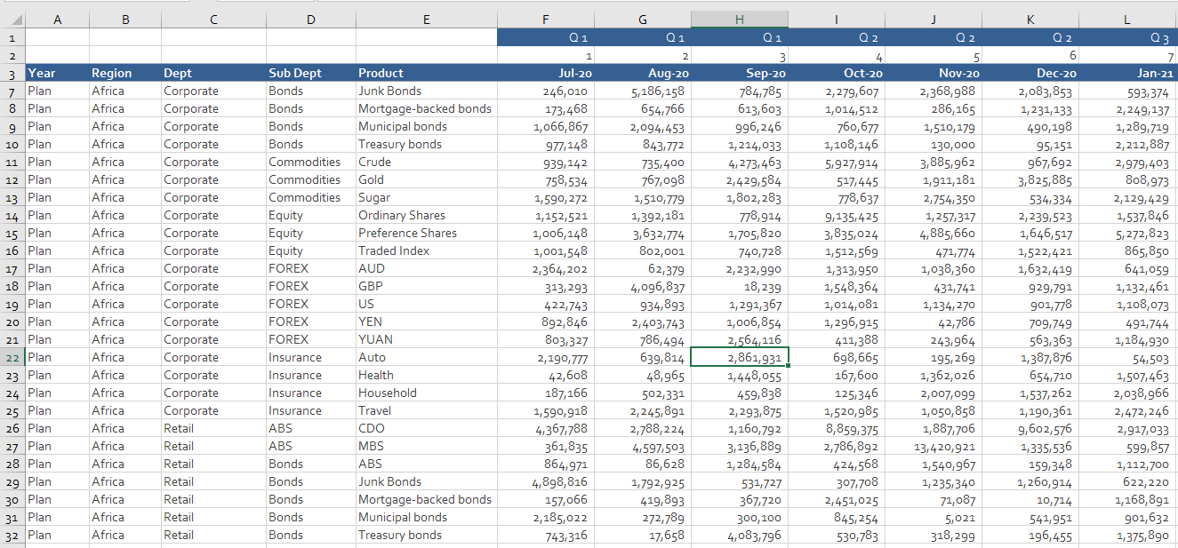
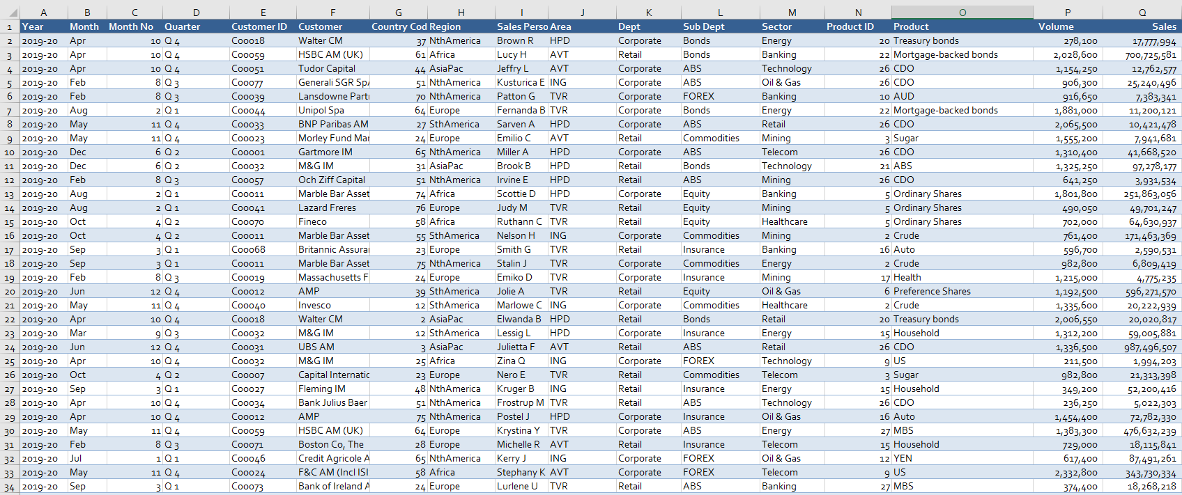
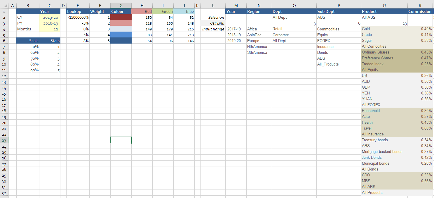
The file has a dedicated P&L which has a series of linked combo boxes attached to it. The filters help compare sales, volume, commission and transactions. The various departments have automatically generated drill down depending on selection making the combo boxes dynamic.
One of the nice aspects of this dashboard is it uses a heat map to determine performance against a predetermined plan. A colour code is added to the file for exceeding or falling short of financial expectations. This adds a certain dynamism to the report which helps non financial people digest the data quickly and easily. There is a small amount of VBA in the model to help with the heat map and the sorting of data for a clean look and feel.
Users will gain the maximum benefit from this file if they are already competent spreadsheets users. The file is designed for people who use Excel on a regular basis, and are comfortable with using its tools and functions. Incorporation of new data should be plug and play considering the calculations you wish incorporated.
If you have any questions regarding this tool, don’t hesitate to reach out by email directly.
This business tool includes
1 Excel File (16 tabs)


