Creating Cycle Plot Charts
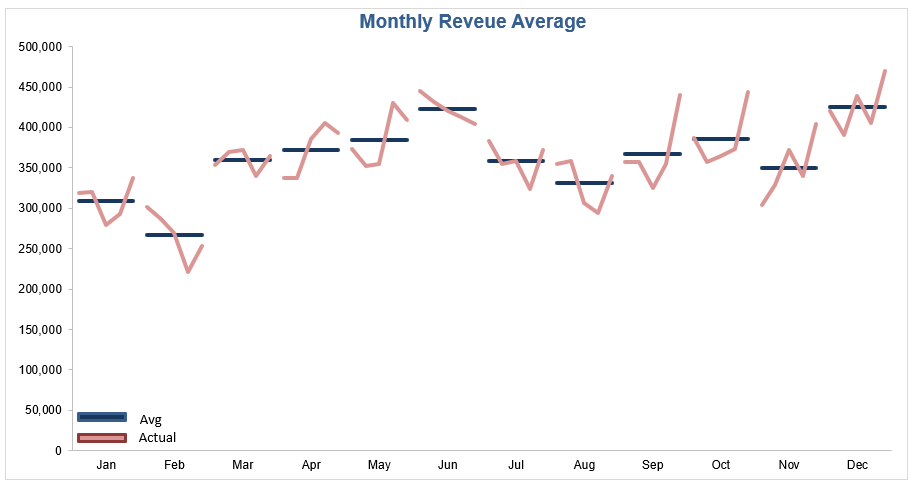
One of the cooler charts I have seen is the Excel cycle plot chart. The rule for creating the cycle plot is to space the data in an unconventional way. A single column is left blank between each period and the data is place in a stepped fashion. The following is the end result of the efforts;
The following is the way the data need to be set up in order to create the above Cycle Plot Chart.
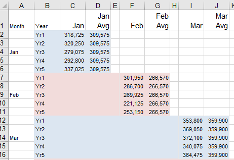
I have used colour to show how the data is stepped in its separation. There is a spare column between each month and the following months data is stored one at the bottom of the prior month, offset by one column. This stepped approach is the reason the cycle plot looks as it does. It is a bit awkward to set up but the result can add value to a dataset. Once the pain of setting the cycle plot is complete you will have a ready made template for any future cycle plots.
To create the chart highlight the Stepped Dataset you have just created. Or in the attached file highlight the area from A1 to AK61 on the Data tab.
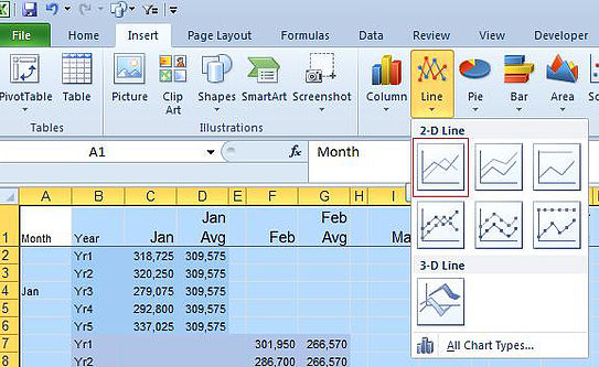
Choose a 2D Line chart, ideally the one highlighted in red.
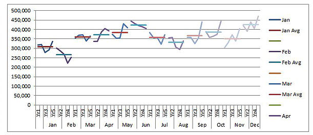
A chart like the following should be on your screen.
Delete the Series Legend on the right.
Now copy Column B and Paste it in Column AN.
Now delete Column B.
Your chart will now look like this.
Insert a Column in Column B and put the data in Column AN in Column B.
Now just change the format of the above chart. Change the line colour of each Series and you can take out the tick marks on the axis. You should be done!!! That is how you create a cycle plot chart. It is all about the stepped data structure.